


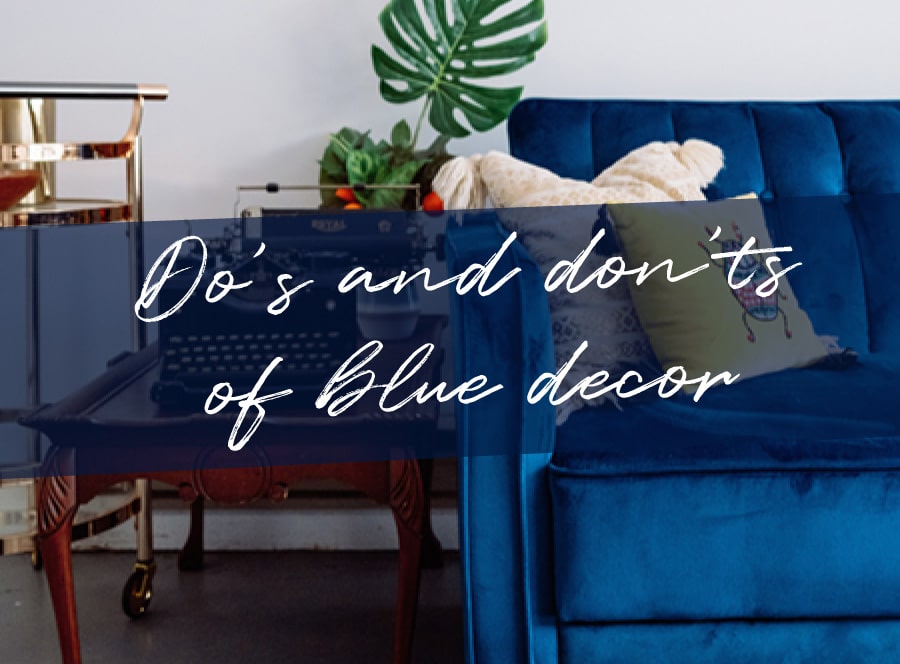

With the ability to be cool and calming or bold and intense, blue is very much a long-standing favourite when it comes to home decor. Emerging decor trends see dark, ambient navy complemented by brassy or golden metallics. While light, soft blues with grey undertones are being used as the new neutrals!
Blue is so versatile but there are a few do’s and don’ts when it comes to creating the perfect decor in your home...
DO be brave when it comes to choosing your colour
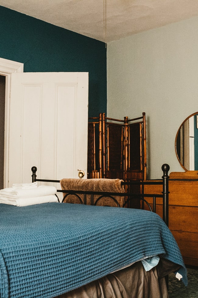
Blue can be soft or bold. The blue spectrum is vast so choosing the correct shade can be quite a task.
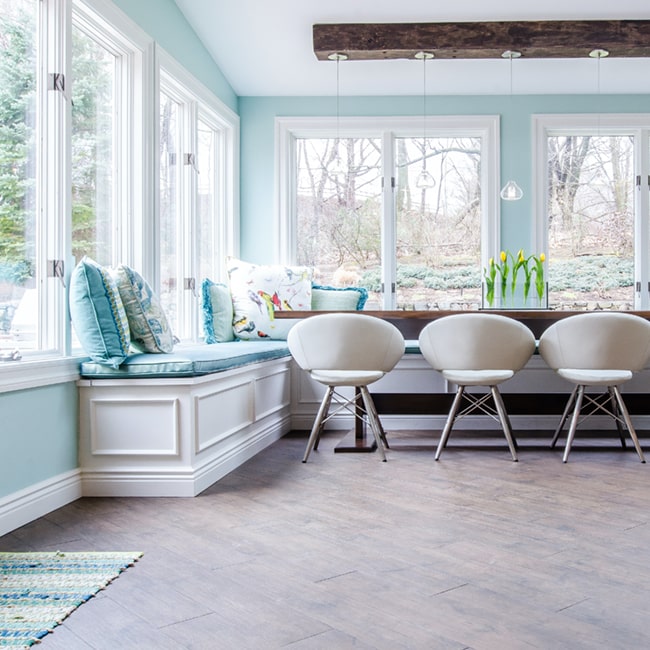
First, think about your room. Is it large with high ceilings or small and cosy? Think about whether you want to go for a warm or cold blue. If you love a rustic beach-inspired style, aqua or duck egg blue is perfect.
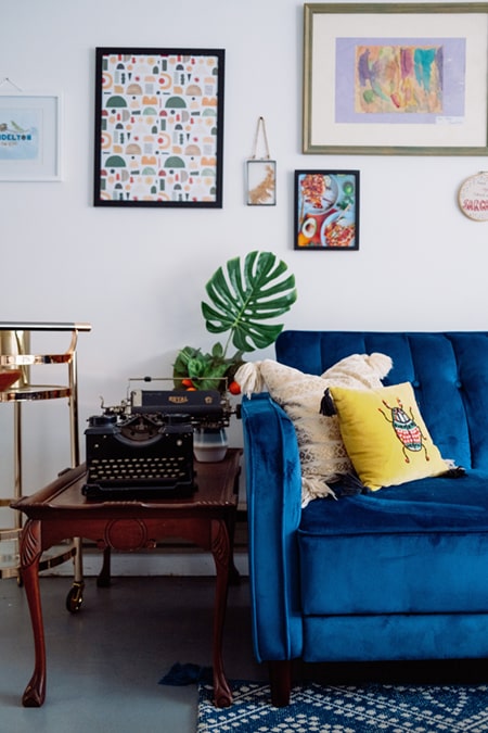
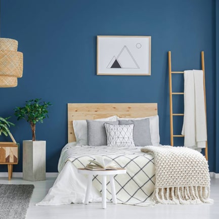
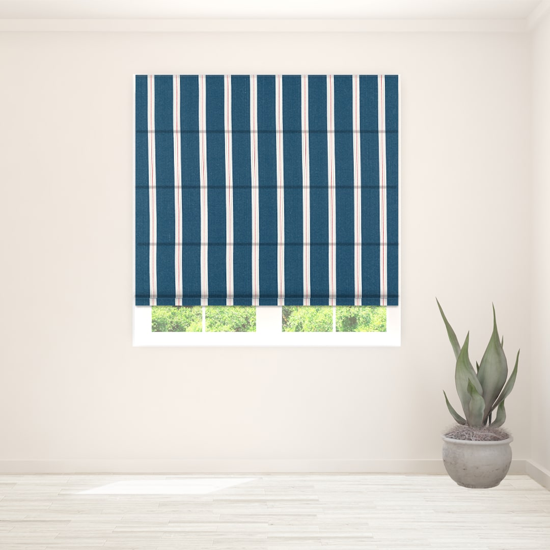
But maybe you’re looking for ambience and warmth? A deep navy accompanied by natural wood and pops of bright colour could be the palette for you.

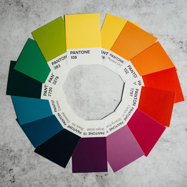
DO understand the colour wheel
Recognising the colour temperature of any blue will help you when considering your matching colour palette. Contrasting colours are those that are directly opposite each other on the colour wheel.
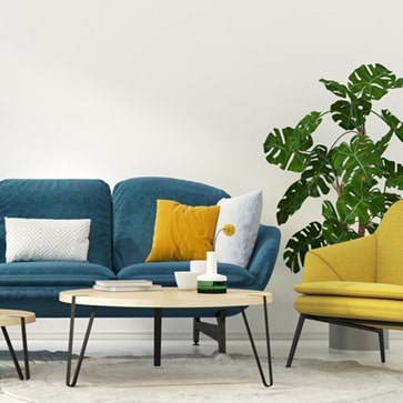
Blue with a green undertone will add warmth, meaning you can pair with peachy-red contrasting colours. Blue with slight purple/violet undertones, sits well with yellows and oranges. A colour combo that is particularly popular of late is deep navy & mustard. Knowing which shades of blue complement each other, can help you later on when choosing other decor and furnishings.
DON'T be afraid to experiment
Don't be afraid to try other ways of adding blue to your home, you don’t just have to paint your walls!
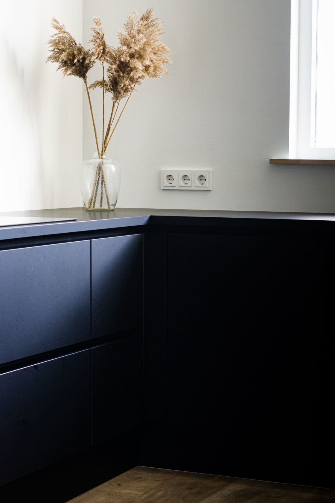
Porches, doors, kitchen cupboards and even ceilings can profit from blue's livable style. Pale, neutral blues lend themselves to upcycled furniture or try richer dark blue for your doors and skirting boards to get a chic traditional vibe.
DON'T forget about furnishings & the finishing touches
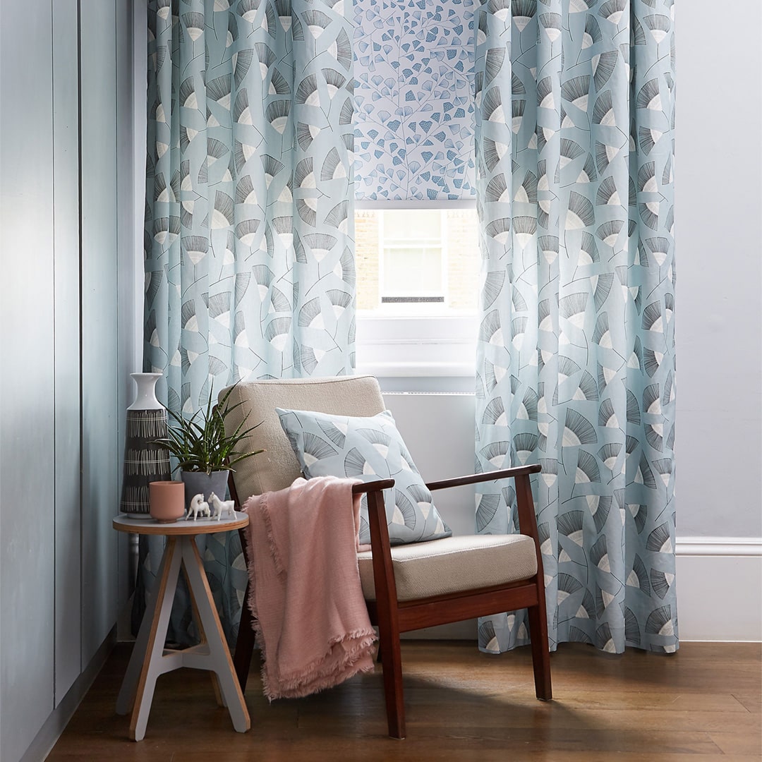
When it comes to furnishings, it’s time to let your unique style shine. Bold, block colours work well when it comes to dark, ambient blues.
Or if you’re going for an airy beach-feel, you can’t go wrong with white. Add pattern and texture in the form of rugs, cushions and throws. Dress your room up with fresh flowers or decorative greenery - it’s all about those finishing touches!
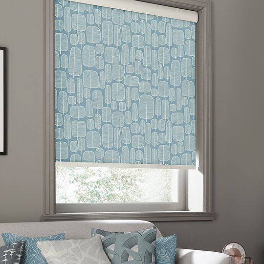
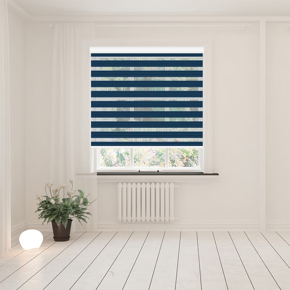
Our Favourite Blue blinds
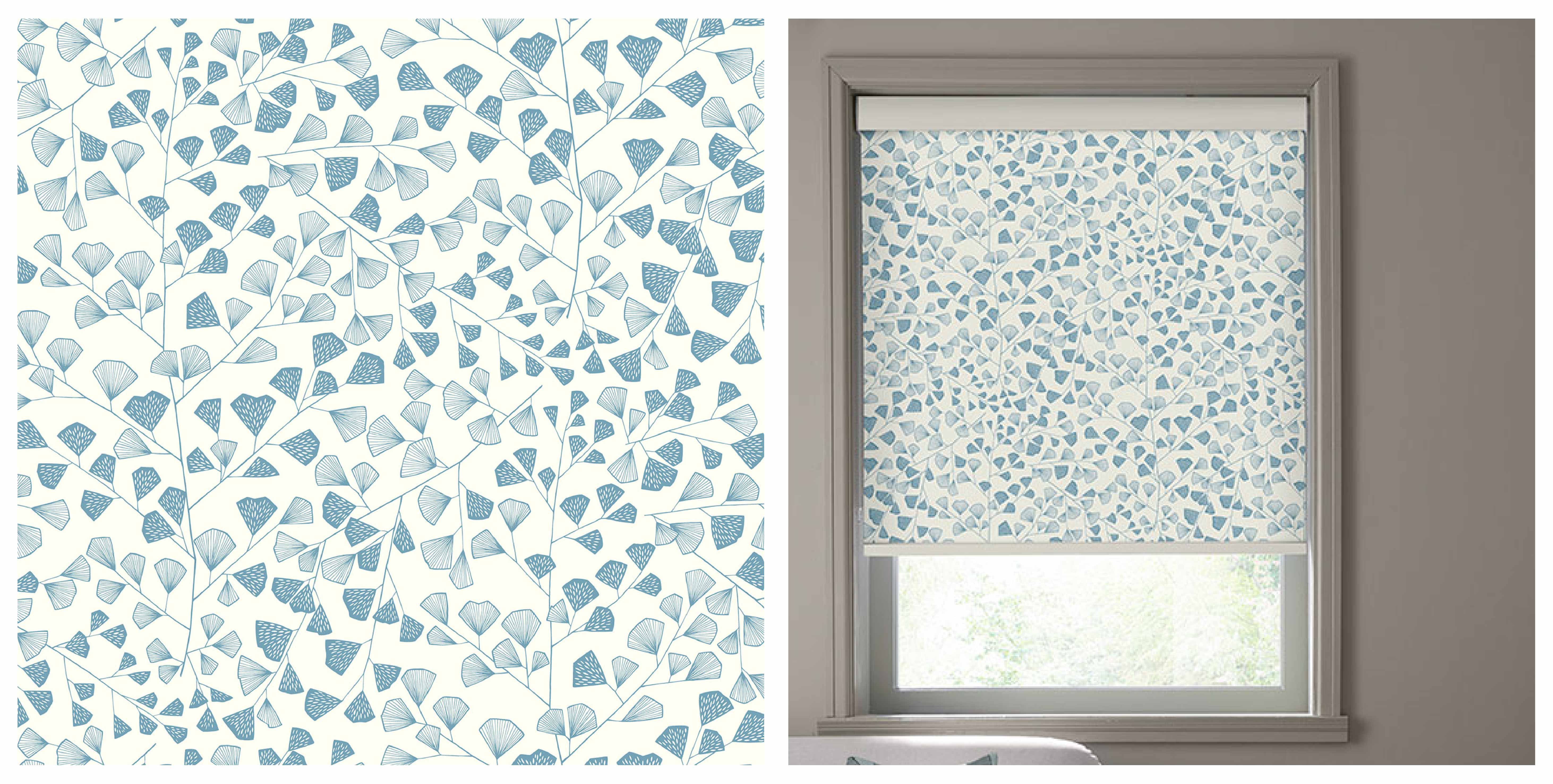
This blue botanical Fern Lighthouse Roller Blind from MissPrint features a delightfully delicate pattern of Maidenhair ferns. The soft blue foliage prints are set against an off white creamy background creating a feeling of openness and space.
This elegant yet quirky Roller blind would pair well with not only soft blues but also with blush pinks, purples, greens and neutrals. To achieve more of a bohemian look, add plenty of textures to your space in cushions, curtains, duvet covers and throws alongside plenty of greenery.


Did you love this blog post? You may also like our latest blog post At home with @raineysresidence
